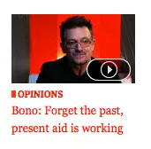
I spend a lot of time reading news online - far too much really. And why not? It’s an easy way to get a wide view of current events. Generally, in any given week, I’ll read through at least 2 stories from The Globe & Mail, The New York Times, The Vancouver Sun, The Guardian, Al Jazeera (english) & Le Monde. There’s a slew of other sites as well, but I’m focusing on “traditional” newspapers and their online forays. Each of these sites shares some layout similarities - I don’t want to talk about their design for this post - a leading article + accompanying photo at the top, under their masthead, then a list or grid of other articles. Some look more “bloggy”, others more “newspapery”. When a story breaks, a fun little activity I do is to canvas the headline for that story from each of the news sites I read to gauge their editorial take on the issue (firmly pro, anti-, on the sidelines, reluctant, eager, etc). I’ve come to the belief that the leading headline (is that the lede?) reflects the political leanings of the paper more than any other visible element. As a result, headlines are often somewhat misleading as to the content of the story hidden behind it - the lede is there to “sell” after all. Because all the article titles in an online paper are links, this is the information that I have to decide whether or not to read a story - there’s occasionally some intro text for the lede & other important stories, but often, I’m basing my decision whether or not to click solely on the link text. Let’s take a look at 3 photo + headline combos that are around today. First, The New York Times:
Now let’s have a look at a headline I pulled from the Washington post today:
Finally, the Globe and Mail:


